E*Trade
Welcome Centre
Improving the Onboarding Experience for first time investors
Understanding User Hesitancy
E*Trade challenged us to provide an alternate approach to their current investor’s welcome centre. The rate at which accounts were funded was lower than expected and we had to find out why users were hesitant to fund accounts despite already signing up for one.
The exercise also proved difficult because we could not affect the tool during this project phase. Instead, we focused on crafting a more guided experience throughout the website. The updated designs were then prototyped and tested against the current site.
Role
Web Design, Experience Design, UX Strategy, Usability Testing
Team Members
Andrew Bouchie – Creative Director
Lenton Alson – UX Research
Julie Grates – Content Design
Category
Financial, Investing
Duration
April – October 2019
Identifying Pain Points along the User Flow
Initial research showed that customers were frustrated with the funding process because it took 2 – 5 business days to complete. We needed to adjust their expectations and educate them on why it takes so long. We also took pains to assure them that funding was proceeding as it should. (Even though it might seem to take longer than expected).
Beyond the frustration that arose from funding, we also isolated 3 main themes which we were interested in testing. Some users didn’t understand investing, others weren’t sure of where to start, and others wanted to see how our product stood out from competitors before they funded their accounts. We were unsure which theory was accurate so we tested the designs against each other to see which resonated the most with our target audience.
Guiding New Investors through the Process
The 1st direction leaned heavily on the idea that investors were new to investing and needed more guidance and handholding throughout the experience.
I broke down the investing process into smaller, easier to understand steps. By getting users to feel more comfortable doing things at their own pace, I allowed them to complete the process over a longer period of time.
Curating an Investment Inspiration Board
In the 2nd direction, I assumed that investors are familiar with trading, but because there are too many stock options available, they ended up doing nothing anything because of decision paralysis.
I curated a list of trending stocks, pulled in data from TipRanks, and showcased relevant market news and research to help them make a more informed decision.
Providing a Peek Behind the Curtain
The 3rd direction explores the possibility that our users are not new investors but are instead uncomfortable with the more complex nature of our platform.
To address this, I wanted to provide users with a risk-free way to test out the platform. Previously, users couldn’t do anything until they funded the account. I proposed to move that requirement further down the user journey.

Adding Personality to the Experience
Beyond simply testing our theories, we also tried to bring more personality to the website. Because investing tends to be a drier topic, we sought to add a touch of joy and whimsy to the experience by adding more colour, interesting imagery and unusual content. We also added a human touch to the experience by showing portraits of the analysts behind the advice in TipRanks.
Simplifying the charts
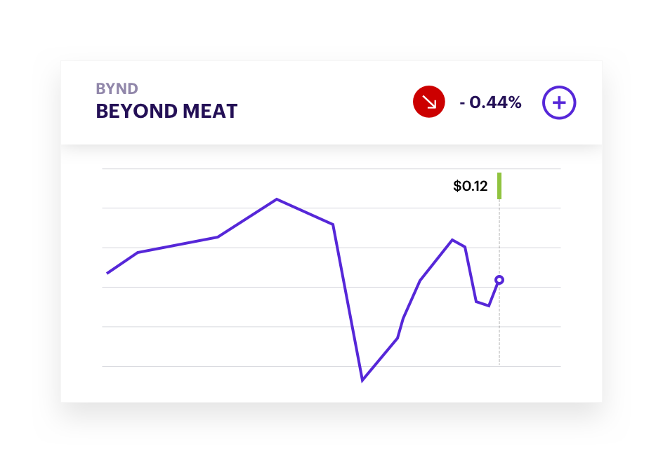
We redesigned the stock charts to remove any irrelevant information which might be confusing to 1st-time investors. The daily highs & lows, market fluctuations, etc. were useful to power users but were very intimidating to newer users who wanted a cleaner and more user-friendly interface.
Contextual Information
Research also showed that some customers wanted ways to interpret their performance through contextual education (e.g. “tell me why my investments are up/down”). We allowed users to expand their investment cards to see a detailed view of the advice, ratings, and other changes that are associated with their stock.

Improving Discovery of Existing Content
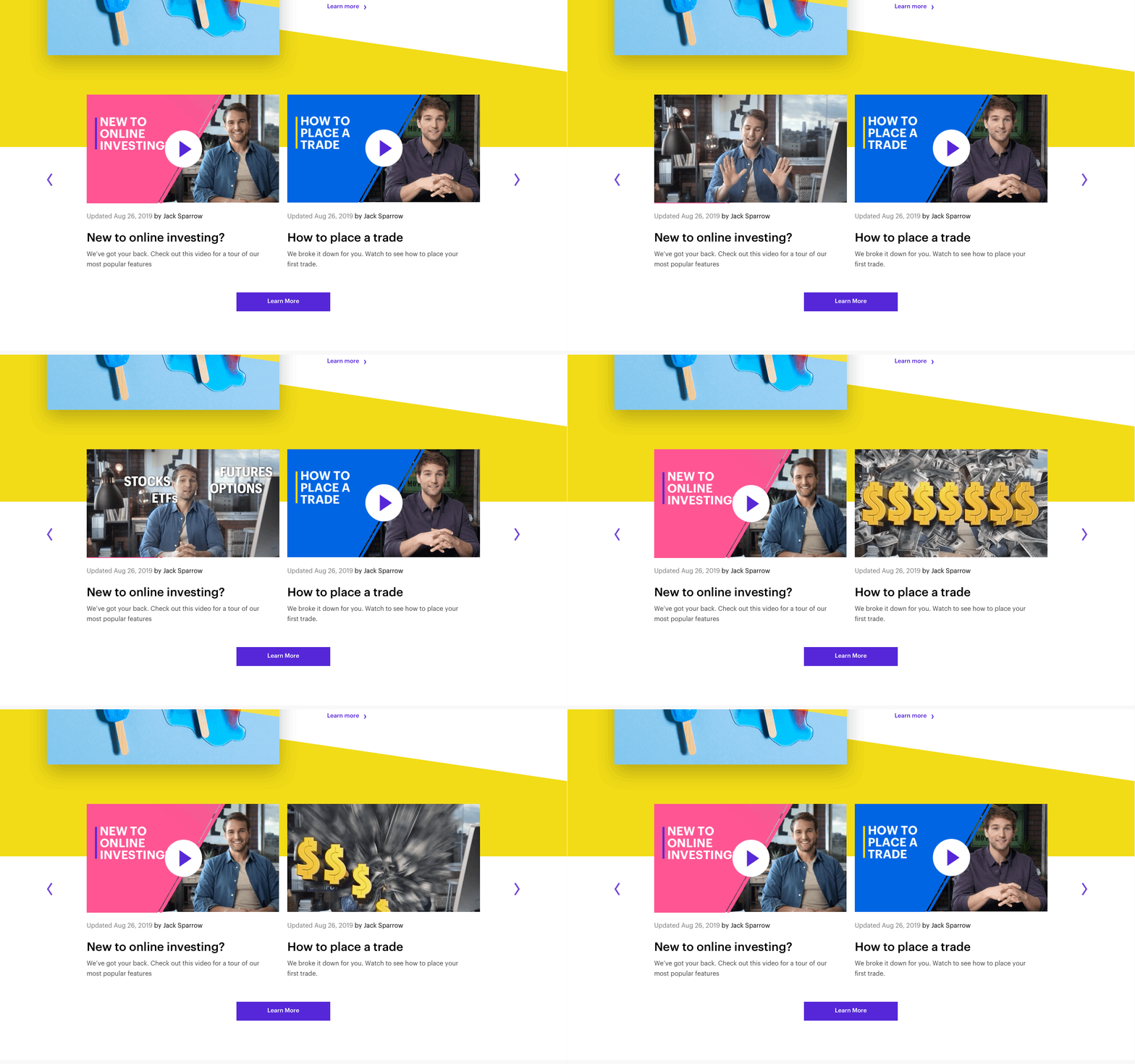
Unlike a lot of tutorial videos in the category, E*Trade’s videos boast great production value and catchy graphics. However, they were not being watched simply because they were hidden behind layers of subpages or featured uninteresting cover imagery. By adding more colour to the cover imagery and making the videos autoplay on hover, we wanted the users to catch glimpses of these videos to show that they’re not the usual boring type of content they associate with the industry.
Bringing the 3 routes to life
Below are the 3 different routes brought to life. They were tested against each other and ultimately, we discovered that showcasing trending stocks and inspiration helped motivate users to overcome their inertia. Beyond understanding the platform or the ins and outs of trading, seeing the potential in the rise of stocks combined with the assurances that funding was going according to plan had the biggest impacts on conversion rates during usability testing..
Project Learnings
Investing can seem like a big hurdle to people who feel lost and don’t know where to start. Taking time to help break the process down helps them feel more in control and builds affinity for our product. Users also want active feedback and assurances about what’s happening behind the scenes (Even if the update is that there is no update). Building trust and familiarity with the product also helps in the long run. Delaying the act of commitment (Funding) until the last possible moment helps the users better understand what they’re getting themselves into.


